How to install bootstrap in angular?

In this article I will show you how to install bootstrap in Angular.
I also recorded a Video version of this Article. So you can watch my video from youtube to see more details:
I assume that you already have angular project installed.
In your project root directory run following command:
npm install bootstrap jquery --saveSome of features of bootstrap depends on the jQuery.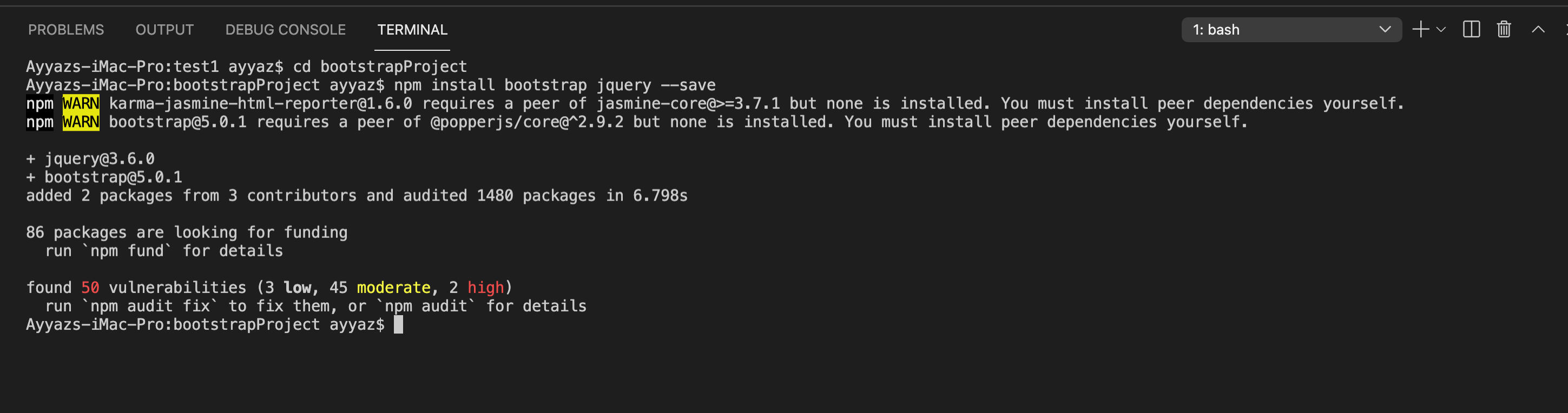
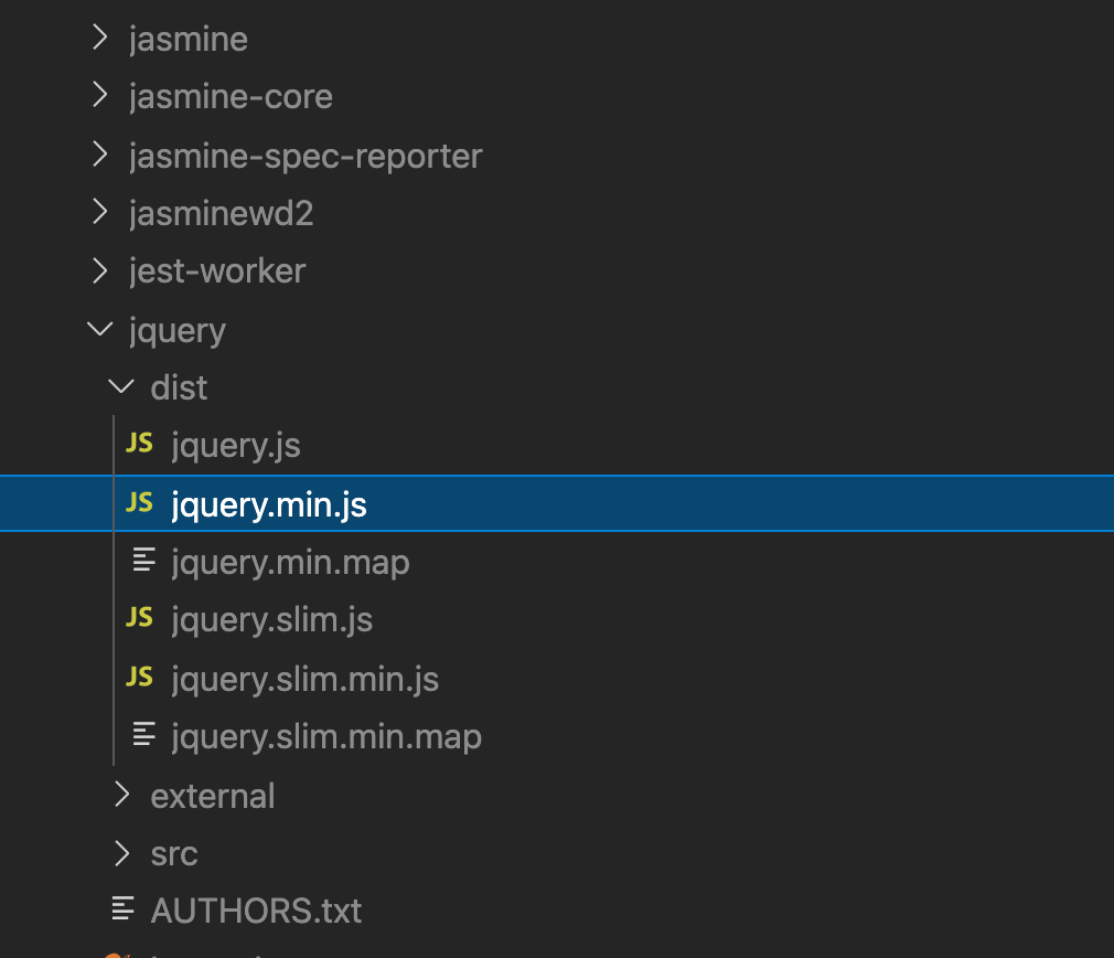
With above command, it will install bootstrap and jquery in the node_modules folder
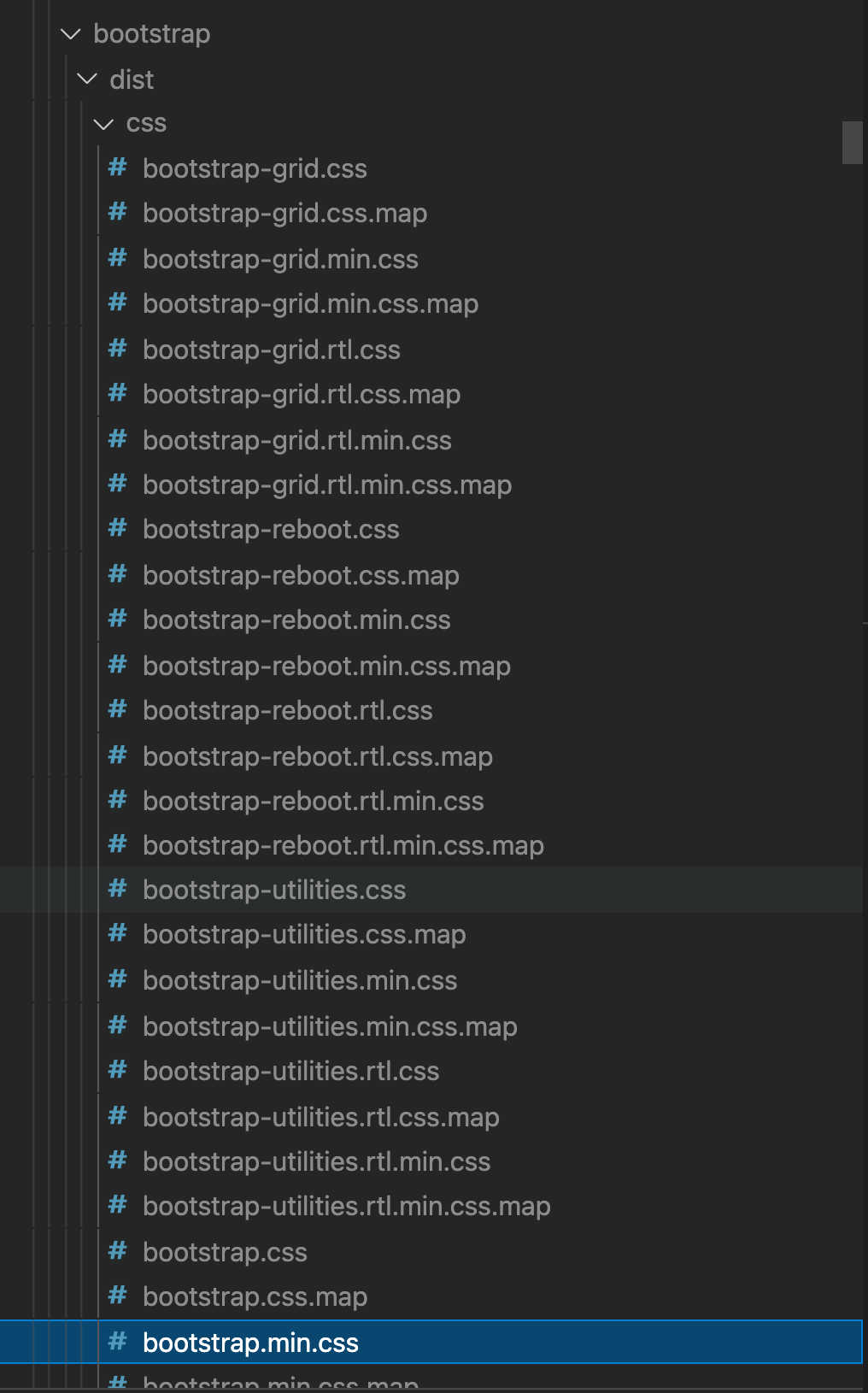
If you scroll down further, then you will also see jquery installed:
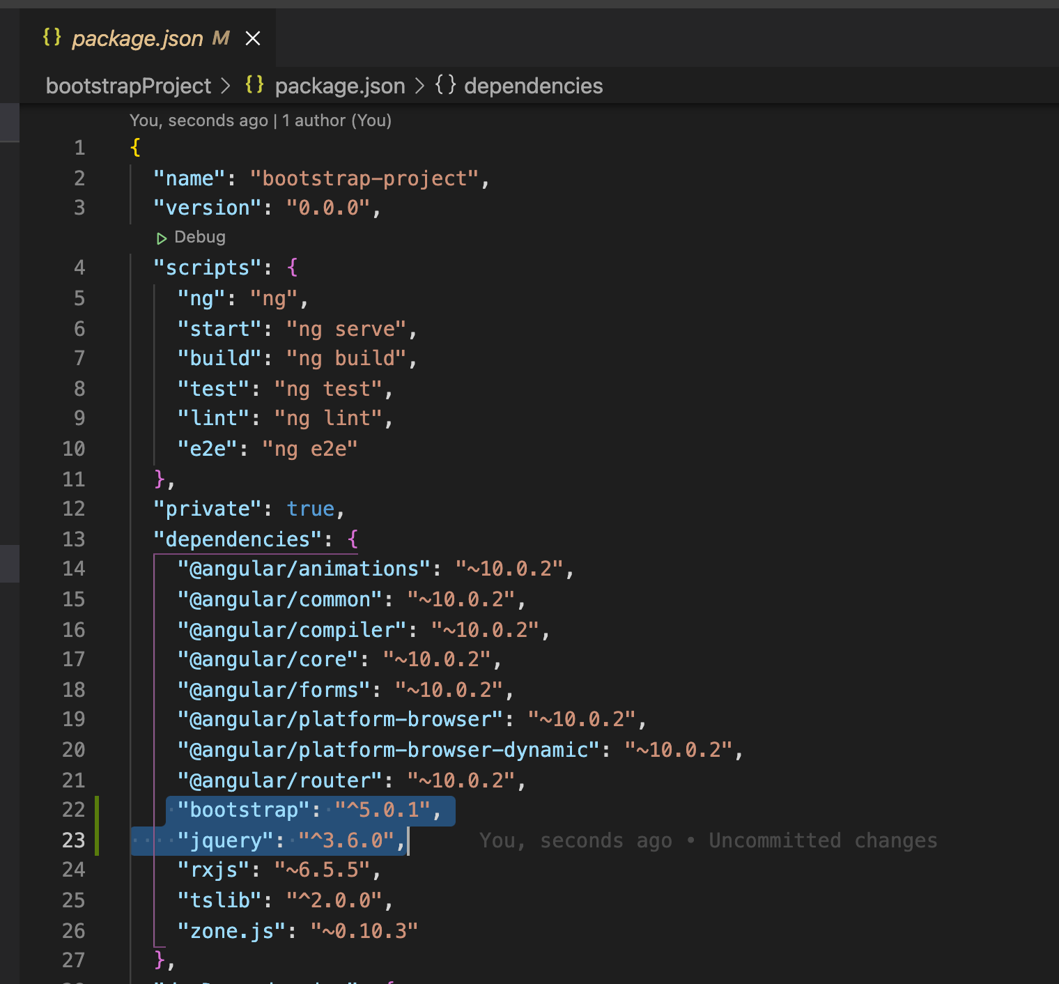
Also it will save the package name in the package.json file
After installing bootstrap we need to configure it to use in our angular project. For that open the angular.json file and add the path of bootstrap.min.css, jquery.min.js and bootstrap.min.js files as shown in screenshots below:
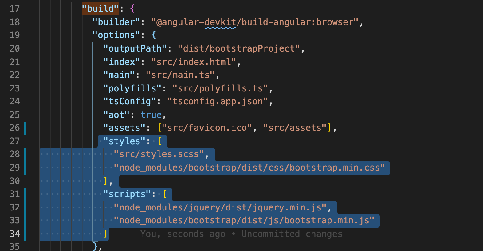
This is how my entire angular.json file looks like now:
{
  "$schema": "./node_modules/@angular/cli/lib/config/schema.json",
  "version": 1,
  "newProjectRoot": "projects",
  "projects": {
    "bootstrapProject": {
      "projectType": "application",
      "schematics": {
        "@schematics/angular:component": {
          "style": "scss"
        }
      },
      "root": "",
      "sourceRoot": "src",
      "prefix": "app",
      "architect": {
        "build": {
          "builder": "@angular-devkit/build-angular:browser",
          "options": {
            "outputPath": "dist/bootstrapProject",
            "index": "src/index.html",
            "main": "src/main.ts",
            "polyfills": "src/polyfills.ts",
            "tsConfig": "tsconfig.app.json",
            "aot": true,
            "assets": ["src/favicon.ico", "src/assets"],
            "styles": [
              "src/styles.scss",
              "node_modules/bootstrap/dist/css/bootstrap.min.css"
            ],
            "scripts": [
              "node_modules/jquery/dist/jquery.min.js",
              "node_modules/bootstrap/dist/js/bootstrap.min.js"
            ]
          },
          "configurations": {
            "production": {
              "fileReplacements": [
                {
                  "replace": "src/environments/environment.ts",
                  "with": "src/environments/environment.prod.ts"
                }
              ],
              "optimization": true,
              "outputHashing": "all",
              "sourceMap": false,
              "extractCss": true,
              "namedChunks": false,
              "extractLicenses": true,
              "vendorChunk": false,
              "buildOptimizer": true,
              "budgets": [
                {
                  "type": "initial",
                  "maximumWarning": "2mb",
                  "maximumError": "5mb"
                },
                {
                  "type": "anyComponentStyle",
                  "maximumWarning": "6kb",
                  "maximumError": "10kb"
                }
              ]
            }
          }
        },
        "serve": {
          "builder": "@angular-devkit/build-angular:dev-server",
          "options": {
            "browserTarget": "bootstrapProject:build"
          },
          "configurations": {
            "production": {
              "browserTarget": "bootstrapProject:build:production"
            }
          }
        },
        "extract-i18n": {
          "builder": "@angular-devkit/build-angular:extract-i18n",
          "options": {
            "browserTarget": "bootstrapProject:build"
          }
        },
        "test": {
          "builder": "@angular-devkit/build-angular:karma",
          "options": {
            "main": "src/test.ts",
            "polyfills": "src/polyfills.ts",
            "tsConfig": "tsconfig.spec.json",
            "karmaConfig": "karma.conf.js",
            "assets": ["src/favicon.ico", "src/assets"],
            "styles": ["src/styles.scss"],
            "scripts": []
          }
        },
        "lint": {
          "builder": "@angular-devkit/build-angular:tslint",
          "options": {
            "tsConfig": [
              "tsconfig.app.json",
              "tsconfig.spec.json",
              "e2e/tsconfig.json"
            ],
            "exclude": ["**/node_modules/**"]
          }
        },
        "e2e": {
          "builder": "@angular-devkit/build-angular:protractor",
          "options": {
            "protractorConfig": "e2e/protractor.conf.js",
            "devServerTarget": "bootstrapProject:serve"
          },
          "configurations": {
            "production": {
              "devServerTarget": "bootstrapProject:serve:production"
            }
          }
        }
      }
    }
  },
  "defaultProject": "bootstrapProject",
  "cli": {
    "analytics": "3c267790-6b84-4e7e-91a8-967937a6c248"
  }
}
After that, if your server is already running then stop it. And run the serve command to start the server again with the serve command:
ng s -oRemove all code from the app.component.ts file and add the following bootstrap related code to see if bootstrap is working fine:
<div class="accordion" id="accordionExample">
  <div class="accordion-item">
    <h2 class="accordion-header" id="headingOne">
      <button
        class="accordion-button"
        type="button"
        data-bs-toggle="collapse"
        data-bs-target="#collapseOne"
        aria-expanded="true"
        aria-controls="collapseOne"
      >
        Accordion Item #1
      </button>
    </h2>
    <div
      id="collapseOne"
      class="accordion-collapse collapse show"
      aria-labelledby="headingOne"
      data-bs-parent="#accordionExample"
    >
      <div class="accordion-body">
        <strong>This is the first item's accordion body.</strong> It is shown by
        default, until the collapse plugin adds the appropriate classes that we
        use to style each element. These classes control the overall appearance,
        as well as the showing and hiding via CSS transitions. You can modify
        any of this with custom CSS or overriding our default variables. It's
        also worth noting that just about any HTML can go within the
        <code>.accordion-body</code>, though the transition does limit overflow.
      </div>
    </div>
  </div>
  <div class="accordion-item">
    <h2 class="accordion-header" id="headingTwo">
      <button
        class="accordion-button collapsed"
        type="button"
        data-bs-toggle="collapse"
        data-bs-target="#collapseTwo"
        aria-expanded="false"
        aria-controls="collapseTwo"
      >
        Accordion Item #2
      </button>
    </h2>
    <div
      id="collapseTwo"
      class="accordion-collapse collapse"
      aria-labelledby="headingTwo"
      data-bs-parent="#accordionExample"
    >
      <div class="accordion-body">
        <strong>This is the second item's accordion body.</strong> It is hidden
        by default, until the collapse plugin adds the appropriate classes that
        we use to style each element. These classes control the overall
        appearance, as well as the showing and hiding via CSS transitions. You
        can modify any of this with custom CSS or overriding our default
        variables. It's also worth noting that just about any HTML can go within
        the <code>.accordion-body</code>, though the transition does limit
        overflow.
      </div>
    </div>
  </div>
  <div class="accordion-item">
    <h2 class="accordion-header" id="headingThree">
      <button
        class="accordion-button collapsed"
        type="button"
        data-bs-toggle="collapse"
        data-bs-target="#collapseThree"
        aria-expanded="false"
        aria-controls="collapseThree"
      >
        Accordion Item #3
      </button>
    </h2>
    <div
      id="collapseThree"
      class="accordion-collapse collapse"
      aria-labelledby="headingThree"
      data-bs-parent="#accordionExample"
    >
      <div class="accordion-body">
        <strong>This is the third item's accordion body.</strong> It is hidden
        by default, until the collapse plugin adds the appropriate classes that
        we use to style each element. These classes control the overall
        appearance, as well as the showing and hiding via CSS transitions. You
        can modify any of this with custom CSS or overriding our default
        variables. It's also worth noting that just about any HTML can go within
        the <code>.accordion-body</code>, though the transition does limit
        overflow.
      </div>
    </div>
  </div>
</div>
Now check app in the browser. You should see something like this:
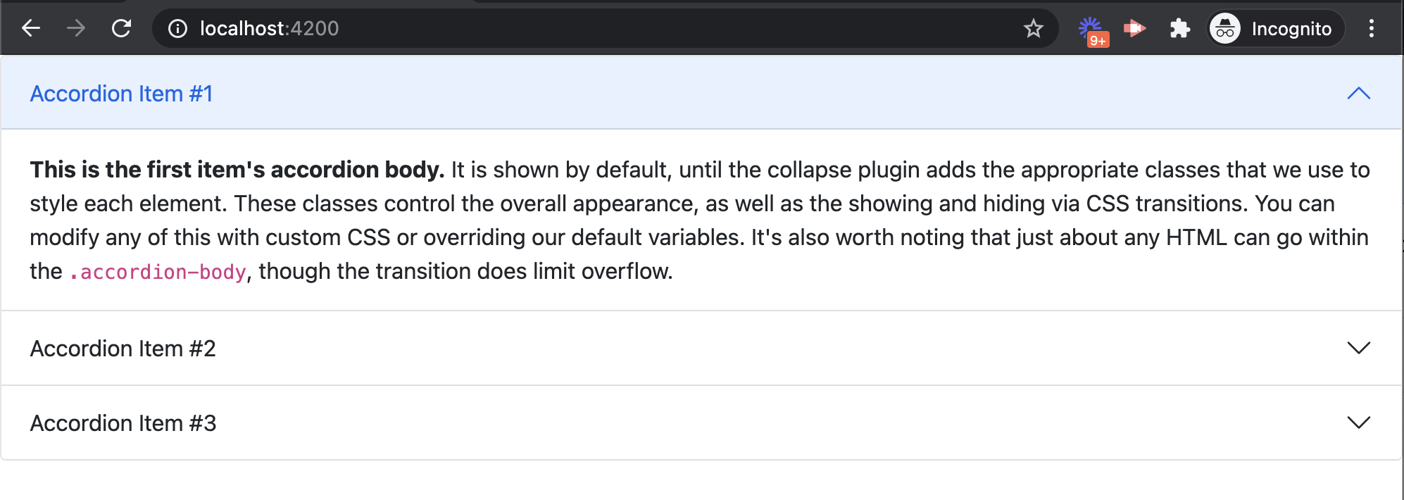
Now you can see that bootstrap styles and animations are working perfectly fine.
If you have any questions or you also want to share any suggestion then please leave your comments below. Also, share this article to help others.
I also have a Youtube channel where I keep recording a lot of useful content for you. So don’t forget to Subscribe to my channel and click on the bell icon to see all notifications.