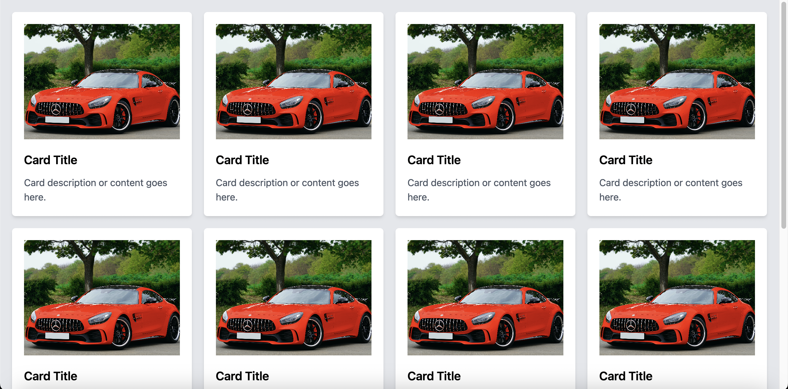
Complete Guide to Creating a 4-Column Grid Layout of Cards Using Tailwind CSS

Complete Guide to Creating a 4-Column Grid Layout of Cards Using Tailwind CSS
Introduction
A grid layout is a quintessential design structure for modern websites. In this tutorial, we'll dive deep into how to construct a 4-column grid layout using Tailwind CSS, ensuring your content shines brilliantly on all devices. Let's get started!
Prerequisites:
- A foundational understanding of HTML and CSS.
- Tailwind CSS set up in your project or an ability to include it via CDN.
Table of Contents
- Setting Up Your HTML File
- Crafting the 4-Column Grid
- Beautifying the Cards
- Wrapping Up
- The Complete Code
1. Setting Up Your HTML File:
Kick things off with a standard HTML5 layout:
<!DOCTYPE html>
<html lang="en">
<head>
    <meta charset="UTF-8">
    <meta name="viewport" content="width=device-width, initial-scale=1.0">
    <title>Grid of Cards</title>
</head>
<body>
    <!-- Content will unfold here -->
</body>
</html>
For our Tailwind CSS magic to unfold, let’s integrate it:
<link href="https://cdn.jsdelivr.net/npm/tailwindcss@2.2.19/dist/tailwind.min.css" rel="stylesheet">2. Crafting the 4-Column Grid:
Within the <body>, position a <div> imbued with the class grid grid-cols-4 gap-5. This instructs the layout to break into 4 columns with a generous gap:
<div class="grid grid-cols-4 gap-5">
    <!-- Cards will be nestled here -->
</div>
3. Beautifying the Cards:
To breathe life into each card:
<div class="card bg-white p-5 shadow-md rounded-md">
    <img src="IMAGE_URL" alt="Card Image" class="w-full h-48 object-cover mb-5">
    <h2 class="text-xl font-semibold mb-3">Card Title</h2>
    <p class="text-gray-600">Some enticing description or content.</p>
</div>
Remember, the essence lies in the classes:
bg-white,p-5,shadow-md,rounded-mdcraft the card's structure.- The image adopts
w-full,h-48,object-cover, andmb-5to align perfectly. - Text elements like
<h2>and<p>use classes for visual hierarchy and spacing.
Spawn as many card <div> as you need.
4. Wrapping Up:
You've just brewed a captivating 4-column grid layout! The best part? It’s responsive. Tailwind CSS’s utility-first approach ensures concise code that's visually delightful.
5. The Complete Code:
For those who'd love a ready-to-use snippet:
<!DOCTYPE html>
<html lang="en">
<head>
    <meta charset="UTF-8">
    <meta name="viewport" content="width=device-width, initial-scale=1.0">
    <title>Grid of Cards</title>
    <link href="https://cdn.jsdelivr.net/npm/tailwindcss@2.2.19/dist/tailwind.min.css" rel="stylesheet">
</head>
<body>
    <div class="grid grid-cols-4 gap-5">
        <div class="card bg-white p-5 shadow-md rounded-md">
            <img src="IMAGE_URL" alt="Card Image" class="w-full h-48 object-cover mb-5">
            <h2 class="text-xl font-semibold mb-3">Card Title</h2>
            <p class="text-gray-600">Card description or content.</p>
        </div>
        <!-- Replicate above card as per your requirements -->
    </div>
</body>
</html>
Bonus: For visual learners and enthusiasts, we've brewed a detailed video guide on this. Dive into our Youtube Tutorial to witness this grid layout come alive. Don't forget to like, share, and subscribe for more web design magic!
Happy designing and coding!