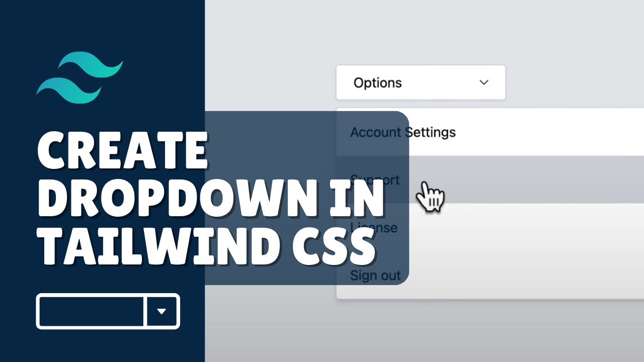
How to Create a Dropdown Menu in Tailwind CSS?

Introduction
Welcome to AyyazTech! In this tutorial, we will explore how to create a dropdown menu using Tailwind CSS. If you're new to Tailwind and need help setting up your project, you can refer to my YouTube playlist for a step-by-step guide on how to install it. Once your Tailwind CSS project is up and running, you can continue with this tutorial.
Setting Up the Project
First, you'll want to have a simple HTML file in your project directory where you'll be implementing the dropdown. Here's how your project structure should look:
- Your Project/
- index.html
- tailwind.css
- ...
Once that's set up, open your index.html file and prepare to add some code.
Designing the Dropdown Button
To start, you'll need to create a div element that will act as our dropdown button. You'll need to apply some Tailwind classes to design it. Here's the code for it:
<div id="dropdown-button" class="border border-gray-400 rounded px-5 py-2 cursor-pointer flex justify-between">
  Options
  <img src="/icon.svg" width="20" />
</div>
In this code snippet, the dropdown button is styled with rounded corners, a gray border, and padding. We've also added an SVG icon to indicate that it's a dropdown button. You can either include an SVG directly into your HTML, or you could reference it as an image, as done here.
Adding an Arrow Down Icon to the Button
You'll notice that we added an SVG icon for the dropdown button. You can download an arrow down SVG and include it as an image in your HTML like so:
<img src="/icon.svg" width="20" />This will display the arrow down icon on the right side of your "Options" text.
Designing the Dropdown Menu
Next, we'll design the dropdown menu itself. This involves another div element with a set of options. Here's the HTML structure for it:
<div id="dropdown-menu" class="hidden absolute top-50 w-400 border border-gray-300 bg-white shadow-md mt-2">
  <div class="py-4 px-4 cursor-pointer hover:bg-gray-100">Account</div>
  <div class="py-4 px-4 cursor-pointer hover:bg-gray-100">Settings</div>
  <!-- Add more options here -->
</div>
In the above code snippet, the dropdown is initially hidden by using Tailwind's hidden class. We also added classes to style the dropdown options.
Styling the Dropdown Options
To make the dropdown menu look better, we've added some hover effects, borders, and background colors:
<div class="py-4 px-4 cursor-pointer hover:bg-gray-100">Account</div>
<div class="py-4 px-4 cursor-pointer hover:bg-gray-100">Settings</div>
When you hover over each option, the background color changes to a light gray, making it easier for users to interact with the dropdown.
Toggling the Dropdown Menu on Button Click
To make the dropdown appear and disappear when the button is clicked, you'll need to add some JavaScript:
<script>
  function toggleDropdown() {
    const dropdown = document.querySelector('#dropdown-menu');
    dropdown.classList.toggle('hidden');
  }
</script>
Attach this function to the button using an onclick attribute:
<div id="dropdown-button" onclick="toggleDropdown()" class="border border-gray-400 rounded px-5 py-2 cursor-pointer flex justify-between">Fixing Selection and Font Styling
To prevent the text from being selected when the button is clicked quickly, you can add the following class:
<div id="dropdown-button" onclick="toggleDropdown()" class="select-none border border-gray-400 rounded px-5 py-2 cursor-pointer flex justify-between">Conclusion
And there you have it—a fully functional dropdown menu using Tailwind CSS! I hope this tutorial has been useful to you. If you have any questions or would like to see more tutorials like this, don't forget to like, share, and subscribe to my YouTube channel, AyyazTech.
For a video explanation of this tutorial, you can watch How to create a dropdown in Tailwind CSS on AyyazTech.